The Analytics and Forecast Dashboard is NOW LIVE! - Shelter Animals Count
- Home
- The Analytics and Forecast Dashboard is NOW LIVE!
01Jun’23
The new Analytics and Forecasting Dashboard is now available! This new tool visualizes your organization’s trends and rates in one easy format. Not only can you look at your past data, but you will also be able to view forecasts for where your intakes, outcomes and population will be in the next three months.
This new tool has three views: Population Balance Calculation, Intakes and Outcomes. You can filter any of the views by year, species and location (if your organization has more than one location). Monthly rates for the selected year are also included, allowing you to quickly visualize how the values change from month to month.
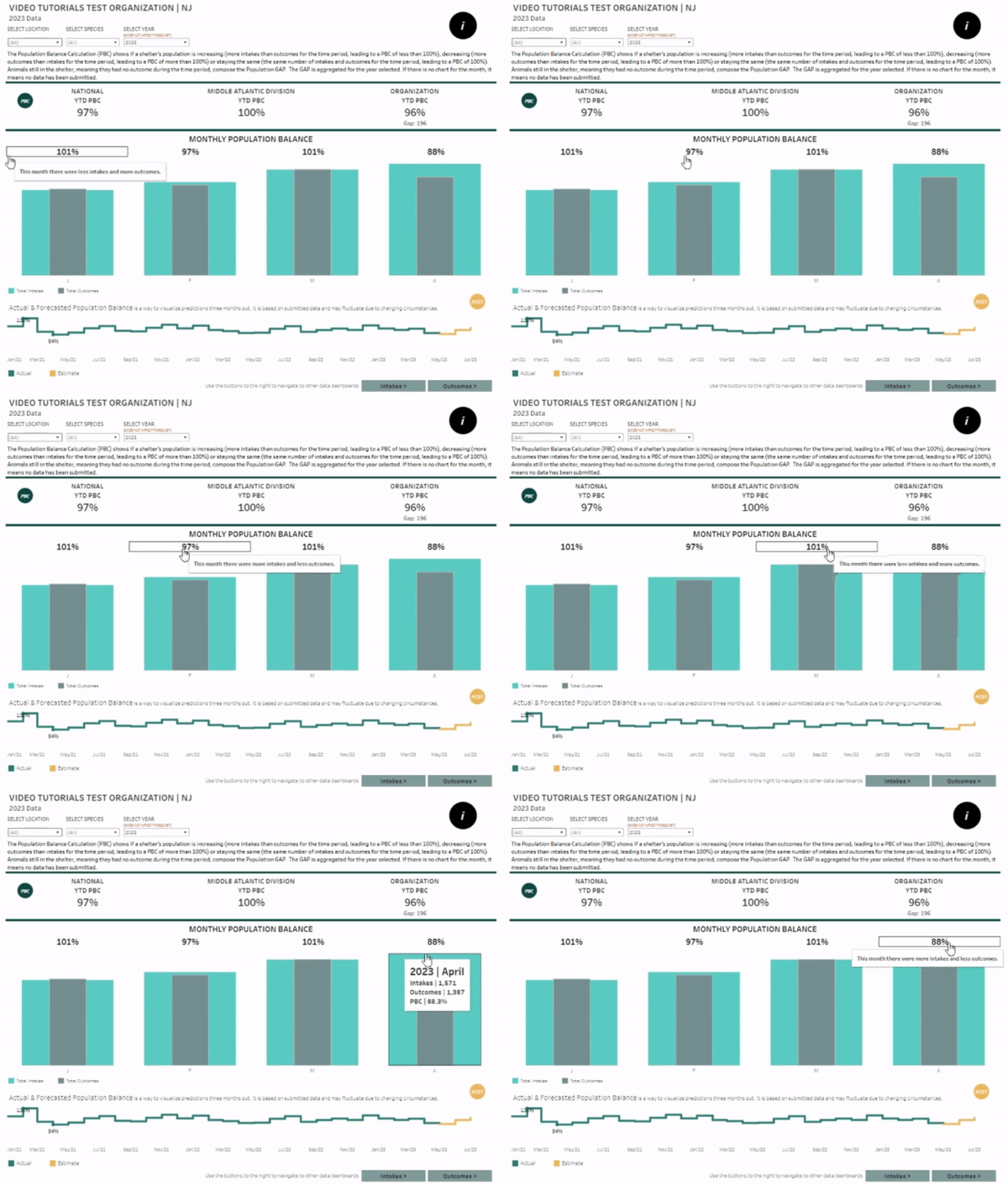
Population Balance Calculation View
We understand that interpreting PBC may seem complex. Rest assured, our new dashboard empowers organizations to confidently navigate it. Simply hover over a monthly rate, and a pop-up will appear to help interpret the data.
Be sure to check out the line chart tool at the bottom of the dashboard, as well — the forecast model takes the last 24 months of data and shows where your organization will be in the next 3 months!
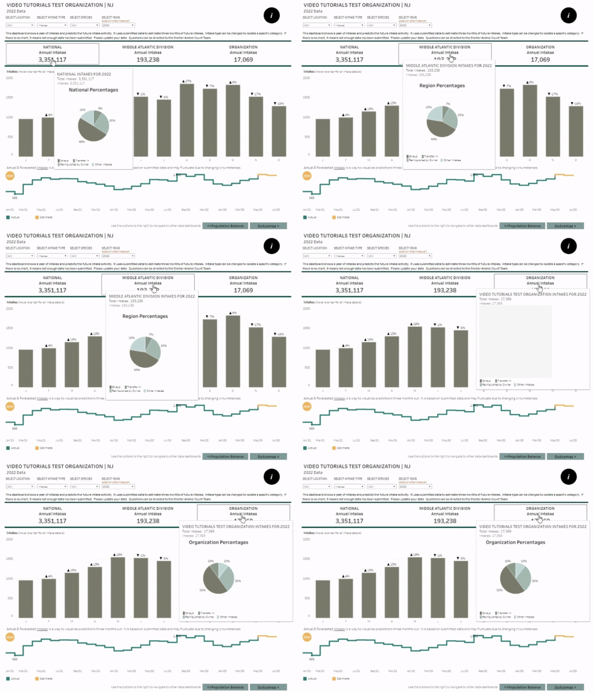
Intake View
Dive into national, regional and organization-level intake totals. If you scroll over any of the values, you will be able to see totals broken down by intake type. Note: All organization intakes are included in the national and regional aggregate counts — organizations with partial data have not been removed.
Once again, make sure to explore the line chart tool located at the bottom of the dashboard. It utilizes the last 24 months of data to provide a forecast model, revealing your organization’s projected position over the next 3 months!
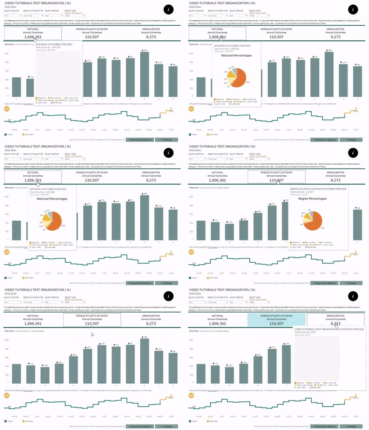
Outcomes View
This view is functionally identical to the intake view, except this view represents aggregate outcome counts. Hover over the national, regional and organization-level counts, you will see total outcomes broken down by type. This view also includes similar forecasting options to the Intake and PBC views.
